google redesigns its SERPs (to make ads less obvious)
In an apparent move intended to be evil, Google have just rolled out a new SERP interface.
First impressions are:
- Although it seems to have more space, it also seems to make everything harder to read
- Ads are very much more ‘discreet’ (ie they blend in with the ‘organic’ listings)
- The Goooooooooogle pagination no longer straddles main content and r/h side content, making it appear tiny.
Harder to Read
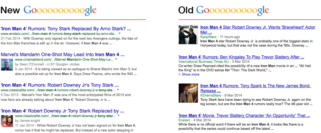
The reason it’s harder to read is that they’ve done away with the underline. Compare the following two screens taken just now with new Google on the left and old Google on the right (take from Google News SERPs as they seem unaffected by the change):

Goooooooooogle is smaller
At first glance, the Gooooooogle pagination looked a lot smaller than it actually was – just 3px difference

Ads are more ‘discreet’
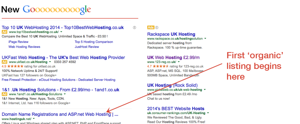
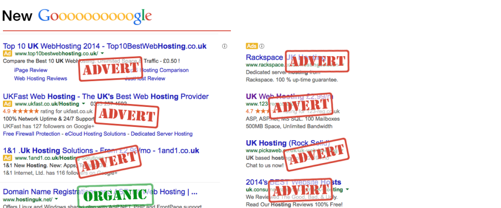
Well I say discreet, I really mean that if you didn’t already know where ads are usually placed on a Google SERP, you would just start clicking ads without realising.

In case you are having difficulty deciphering what is an advert, then take a look at the image below

Wait, Google said “Don’t be evil”, right?
Well, those days are long gone. If Google believed they were building a better ‘search experience’ for the consumers then they wouldn’t have made shops pay to be included in the Shopping search results.
It’s all about the money, honey. And that’s a real damn shame.
Filed under: Google - @ March 10, 2014 6:33 pm