Pixel Perfect was so 2005…
You may not have noticed, but the winds of change are blowing through the corridors of the world wide web. I’m not talking about obvious changes, like increased usage of HTML5, CSS3, and jQuery, but a change in the attitudes of web developers across the globe.
There was a time, not so many years ago, when all sites were expected to display and function in exactly the same manner regardless of browser. This was the way I was taught to code, and it is the way many sites still operate today, but why are non-essential design effects being left out for older browser by so many leading websites and is this the right path for the future of web design and development?
A Website: From conception to birth
The way most websites come into being is that some guy or gal somewhere has a great/mediocre/fatuous idea and has a burning desire to share it with the world. They choose someone to design the site to their specifications. The designer will choose lots of fantastic PhotoShop effects depending on the decade:
- 90s: bevel and emboss, drop shadow
- early 00s: brushed metal, drop shadow
- late 00s: rounded corners, drop shadow
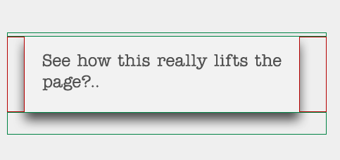
The developer takes the PSDs and works out how best to build it. Take the following example:
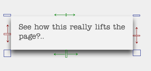
Now, cutting this up into browser readable HTML/CSS for all browsers would mean at least one big background image, or if that box was dynamic, at least 4 images:
but probably 8 images:
As you can imagine, developers tend to hate rounded corners and drop shadow.
Until now.
CSS3 has entered our lives and suddenly, things that used to take three or four hours, take 5 minutes. All of the above is now possible with Cascading Style Sheets. Want a drop shadow on a box? Why not try:
box-shadow:0 5px 5px 2px rgba(0,0,0,0.2);
So the temptation to just use CSS3 and leave out the graphics is very compelling from a developer’s point of view. Not only that, for site’s with huge traffic, you are cutting down page requests and DNS lookups. Everyone’s a winner, surely?
Microsoft says it’s their ball and no-one else can play
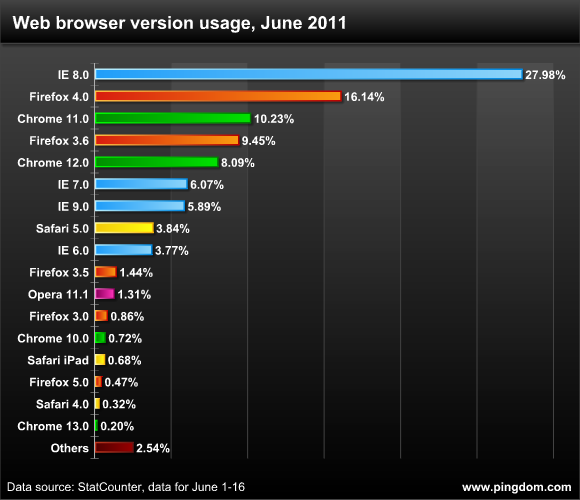
So here’s the catch. According to recent figures, almost 40% of users are on Internet Expolorer versions 6,7 or 8
As those versions of Internet Explorer cannot display most of the CSS3 tags, anyone who codes sites exclusively with CSS3 will have 40% of users seeing a different version of their site. But as the benefits continue to stack up, are there any big boys out there who are starting to take the risk?
All The People On The Left: Wap Bam Boogie
A few of the sites on Alexa’s top 100 are starting to dip their toes in the water: Apple and flickr have started to show drop shadows and rounded corners only in CSS3, but only as small elements on their site. YouTube and Mashable go slightly further, making some of the CSS3 elements a design feature. But way, way out in front is Twitter. Just compare the following screengrab taken using Adobe’s excellent BrowserLab:
As you might expect, we don’t have rounded corners on the text input boxes in IE7, no text shadow on the main title, but there’s more than this as there is no world background image in IE7 either. The IE7 user experience is very different from that of someone using Chrome, Firefox, Safari et al. But take a step back and essentially they are the same pages; they give the same feel to the user.
All The People On The Right: Boogaloo
Then there are those who don’t: almost everyone else. Probably the most interesting case is Vimeo, whose site almost cries out for CSS3’s rounded corners, as you can see from the next screengrab:
The developers at Vimeo have obviously spent a long time making sure the site displays perfectly to all users and hats off to them, but the argument that will be put to them, and probably internally from their developers, is aren’t these development touches pretty irrelevant in the grand scheme of things and won’t such practices be unsustainable in the years to come?
Into the Bear Pit
I can see the benefits of both sides of the argument and have dropped a rounded corner image as many times as I have cut one out, so I thought I should ask some men at the coal face what they think. I asked Twitter and Vimeo for comment, but didn’t hear anything back, so I went in search of developers from both camps to see what they have to say. Some weren’t available for comment, but two very nice, talented chaps got back to me and what they have to say make for interesting reading.
Before we go any further, they have asked me to point out that the views expressed here are their own and not necessarily those of their employers, their companies, their bosses or their dogs.
In the Blue Corner
 First off, HTML5 evangelist and British developer for Twitter in California, Ben Ward:
Q: Did the CSS3 only trend start with Twitter?
Twitter certainly didn’t start it. Plenty of people have been using CSS as a progressive enhancement device for a while, and even inside Yahoo a few years ago there was design advice floating around that for non-essential design elements, it was fine to use CSS and let the interface be square in IE.
At Twitter we make good use of CSS box shadows, rounded corners and fixed positioning. There are also various animations that only happen in CSS, although in major cases we do use some JavaScript to simulate the fixed positioning (e.g. the detail pane.)
Really though, this is just pragmatism. We’re at a point now where IE6 usage is smaller than it was a year ago, smaller than two years ago. Rolling in new enhancements on an existing site would usually result in smaller incremental enhancements, but when you start from scratch the approach is deeper rooted. Hacks and adjustments for box models and inline blocks get added as patches, for example, rather than baked in from the outset.
Q: Will everyone follow Twitter’s example?
Certainly, although don’t expect it to just happen: Sites will take the opportunity to change their front-end architecture when they do a full site redesign or rebuild. That only happens every few years at most. Plenty of sites will just be bolting on to their existing templates for a while.
But motivating the full, gradual support approach to visuals are two main factors I think: Browser capability, and designer experience. Enough browsers now support CSS3, and are iterating quick enough, that you can implement something in CSS and know it’ll be seen by a significant number of users. Browsers are also iterating so fast, and auto-update is becoming standard, such even if support is missing today, you can have higher confidence in users getting the feature in the near future.
Second though, you need designers who embrace the web as a medium. That means an understanding of gradual support for different features across different browsers, and accounting for that in design. It means thinking about pages at different widths (or at least, an enthusiasm to work with engineers who will be applying that adaptability to designs anyway.) It also means—and this is certainly not to be under estimated—understanding the performance implications of design details. We’re very lucky at Twitter that our design team are tuned in to these sorts of issues.
If you simulate some CSS with a background image, that costs you an HTTP request. If the resource is on a different domain, that costs you an HTTP request and a DNS lookup. A few years ago, no-one was counting and you see to this day sites loading incredibly slowly because of the vast number of resources they’re pulling down. If I recall correctly, Google managed to measure differences in user engagement by increasing page load times by a mere 400 milliseconds.
Performance is a much better understood facet of web design now, and whilst it doesn’t (and, I hope, never should) drive the direction of a design, it does apply an additional constraint on design. The current visual style of the web is very simple too: Solid blocks and clean edges; there’s not too much visual intricacy going on that would require heavy image work.
Q: How long until we see the end of the rounded corner gif or the transparent gif?
They will exist on the internet forever, artifacts of bygone times left to history. However, I would very much hope that nobody has used a transparent GIF in their implementation at any point in the last two years, and design styles being the way the are, I’m pretty sure rounded corner sprites are done, too.
That said, when support for CSS border-image hits tipping point, there will be an experimental resurgence. We’ll just see whether anyone really wants to design for it on real sites.
Q: Once the decision was made to go down this path, have there ever been any moments of doubt and does anyone ever say ‘why does my version of twitter look different from his?
From a development point of view, I’m very happy working like this. We now have our own new version of generational cruft now (multiple vendor prefixes for gradients, and the like) so to have done away with overlapping image background hacks is good. Mark-up is much cleaner now too. There’s pretty much only one common nested-DIV pattern still in use in my work, which is for centering blocks of fixed width content. Everything else comes out very logical.
As for different renderings of Twitter causing confusion, I don’t believe the presence or absence of a rounded corner or gradient (at least the way we use them) is causing anyone much bother. Developers and publishers have never come to us with complaints from IE7 users that their text boxes are square.
The worst, experience-breaking changes are appearing in IE6. Everyone—ourselves included—needs to be a little more diligent with regard to how the technology degrades. That means remembering to put your floated margin adjustments in, and ensuring that when content does get mis-sized, that it wraps into a sane part of the design.
In the, err, other blue corner
 Next up, Kevin Sweeney, developer at Vimeo:
Q: If developers choose to design for CSS3 with no fallback for certain elements, do you think it good practice that there should be an explanation of the differences on screen, or do users simply not notice or care?
If an actual feature of the site is missing because of a CSS3 solution, there should absolutely be some type of fallback. In any case, users should still see messages that they are using a browser that is no longer being actively supported. I hope that in the next year we can start moving our focus to deprecating IE7 and just forget about IE6 once and for all!
Q: If you were building a site from scratch would you ever advise people to give different browsers a different screen experience?
This is an interesting question when you consider that not all browsers these days are going to be on your desktop. Should you purposefully present a different layout to someone on a 1280×1024 monitor running IE7 versus Chrome running an identical resolution? Probably not. Should you consider your mobile audience and utilize CSS media queries and other methods of optimizing for those users? Absolutely…if you have (or intend to create) a mobile audience, that is. There are some out there who advocate designing and developing a stripped-down, mobile version of your site first, and building out from there. I just can’t get behind that if there’s not a large enough mobile audience to begin with (unless you just like making extra work for yourself). If the need for a mobile version comes about later, okay, then perhaps you need to refactor a bit, but if you’re being smart with your markup and only working with the elements you absolutely need, this should be relatively painless.
Q: Do savings in site speed justify compromise on design?
I try to tackle this on an individual level to weigh the trade-offs involved with any particular decision. I think the most important thing you can do is to first consult your user metrics: do an acceptable majority of your users come to the site with modern browsers capable of what you’re trying to accomplish through a CSS only route? If “yes”, and you can provide a fallback that doesn’t break the design, I say go for it.
Q: How long until we see the end of the rounded corner gif or the transparent gif?
I would hope that nobody is using transparent GIFs anymore! As for rounded corners, I think we’ll still see those around for another 3-4 years until IE8 becomes as irrelevant as IE6 is today. At the very least, I hope that the 24-bit PNG, not GIF, becomes the de facto standard for handling this problem.
Conclusion
There is obviously a great desire and need to push technology forward, something that the web community has been doing admirably for many years, but are we in danger of leaving too many people behind in the rush to get to the gift shop?
As technology improves, the further older versions of IE will be left behind, and, as Ben says, we are duty bound to “be a little more diligent with regard to how the technology degrades“. Does this mean giving older browsers their own cut down version of the site? We do the same with mobile devices, but that is easy to sell to the client – the client with the iPhone and Blackberry and iPad – it sounds sexy and cool and PR-able. Giving older browsers a web experience without the whistles and bells that might not look quite as nice maybe is the way to go, and perhaps, without explicitly creating a new version for older browsers, this is what Twitter et al are doing: They are saving older browser from downloading 8 graphics per block where it is just frippery. Flim-flam. Ornamentation and ostentation.
Kevin makes a good point that if you look at your Google Analytics and find your site users are predominantly on older browsers you simply must make allowances, just as you would if you found that 20% of your site traffic was from mobile devices, you would have to consider making the site easier for those users. Whilst Ben talks about users not asking for or caring about rounded corner he takes great pains to stress that it is only the design enhancements that change and not the core functionality.
CSS3 is here to stay, but unfortunately so are IE6, IE7 and IE8. IE6 is 10 years old in August and still commands the same market share as Safari, and it may never disappear fully. When will we be wishing the death of IE7 and IE8? Probably sooner than you think. The lifecycle of a website design is normally somewhere between 18 months and 3 years, which means in three years time, the majority of sites will be using a lot of CSS3, HTML5 and associated technologies. During this time, many of us are going to have to make the call about which path to tread, and as making designs that display for older browsers will take longer and therefore cost more money, I think we all know which path will be most trodden.
Filed under: Coding,CSS,The Future of Code - @ June 23, 2011 12:21 pm


