Branch completely bypasses IE
Ev Williams and Biz Stone launched Branch this week and as you might expect, not much attention has been paid to older browsers, but exactly how little is a surprise to me.
Last year I took a look at how the shop window of the web was changing so that not every user gets the same experience. Specifically, we were seeing a lot of sites not giving flourish and flair to users on older browsers: things such as rounded corners, drop shadow and so on.
So it is interesting to see the founders of Twitter launching a site that doesn’t cater for IE6, IE7 or IE8. At all.

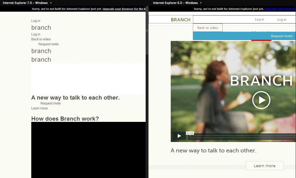
Branch in IE6 & IE7
As you can see, IE6 almost looks better than IE7, and IE8 was a black screen for me (although this could be teething problems). Viewing with IE9 shows the full site, with a warning for the user to upgrade their browser.
It’s an interesting move by Branch, but not one I would emulate for my projects. I suspect this is more down to intended audiences: Branch wants to make the site look yummy and interesting for people who work in the tech industry, in the media, and probably not people who work in accounts departments of biscuit factories (who else uses IE6?…).
UPDATE
One of the developers at Branch has been kind enough to point out that it’s not quite as audacious a move as I had thought. Looks like Adobe Browser couldn’t fetch all 3 CSS files, leading to the completely borked screenshot.
He sent this one and I have taken another shot from BrowserLab below:

Still a little borked
Filed under: Coding,News,Social Media,The Future of Code - @ August 15, 2012 4:52 pm
We actually work decently in IE8, and totally fine in IE9 and up. But we don’t regularly test on IE, hence the banner.
Here’s what we look like in IE7
http://dl.dropbox.com/u/811105/Screenshots/~sg3.png
We’re actually an independent startup, lucky enough to have the support and funding from Obvious Corp (Evan and Biz). Check us out here: http://branch.com/company
@cemre – I stand corrected. The Obvious Corp data came from the guardian piece in the UK